

an abstract photo of a curved building with a blue sky in the background
Fish Farming & Education | Editorial Design & Visual Identity [2026]

The book "Fish Farming and Education: Experiences, Teaching, and Interdisciplinarity" came to me through Even3. The publication explores sustainable fish farming as an interdisciplinary educational tool, covering everything from its historical roots to modern water recirculation systems, while showing how these concepts apply across different areas of education. It also includes lesson plans for basic education, effectively connecting theory, practice, and sustainability.

This is exactly the kind of project I enjoy most, as I truly believe in education as a powerful tool for transforming the world.

an abstract photo of a curved building with a blue sky in the background
Context

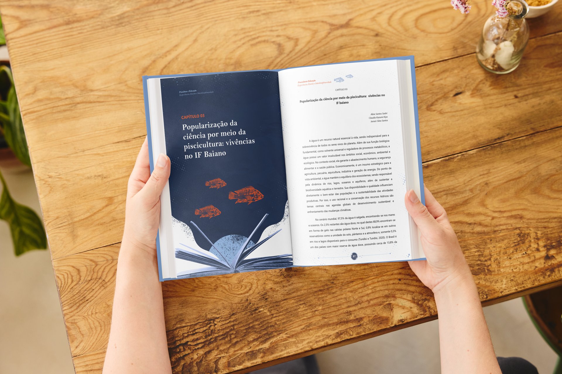
The book "Fish Farming and Education: Experiences, Teaching, and Interdisciplinarity" was developed through Even3. From the outset, the client wanted an e-book that would also work beautifully as a printed publication, utilizing facing pages and a layout designed for a pleasant reading experience in both digital and physical formats.

The main challenge lay in bridging two very different subjects: education and fish farming. The key was to identify visual elements capable of representing both worlds and distribute them throughout the layouts in a balanced way, creating a consistent visual narrative across the entire publication.

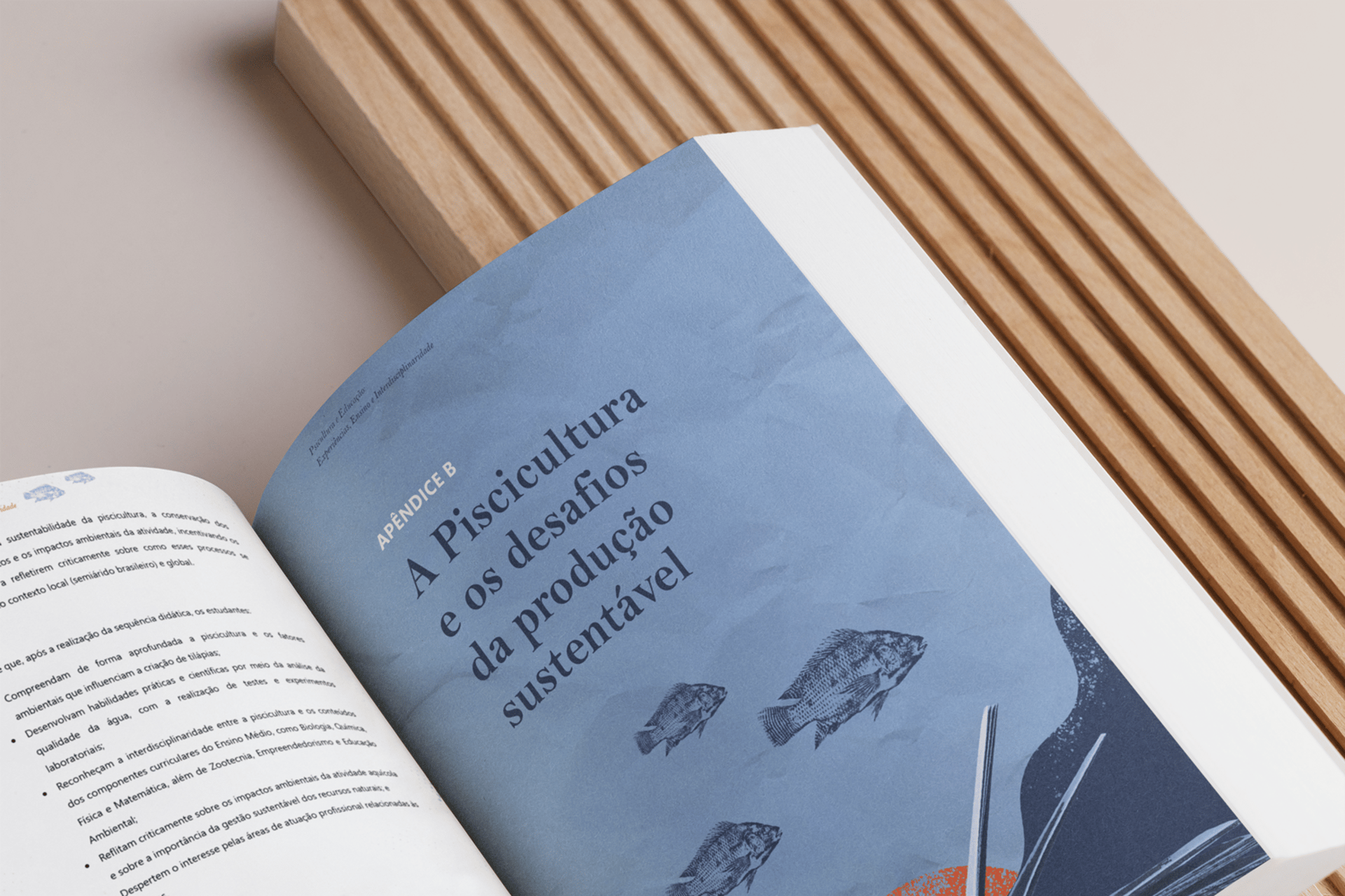
In total, the project involved the editorial layout of 140 pages, organized into four chapters, their respective sections, and two appendices.

Art Direction

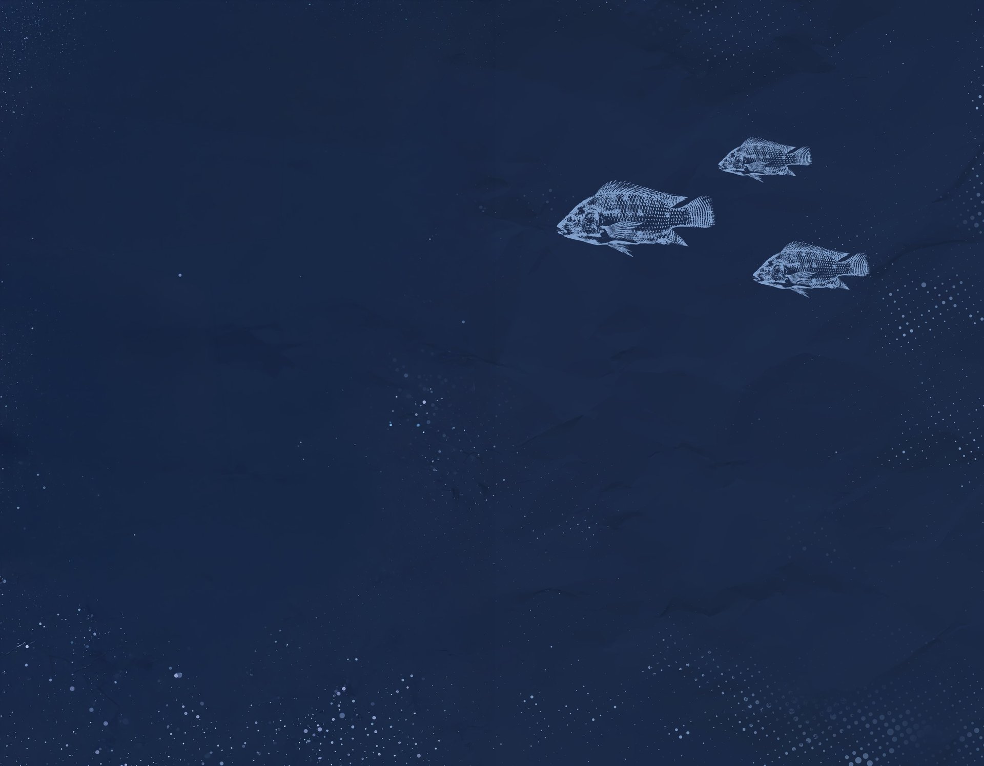
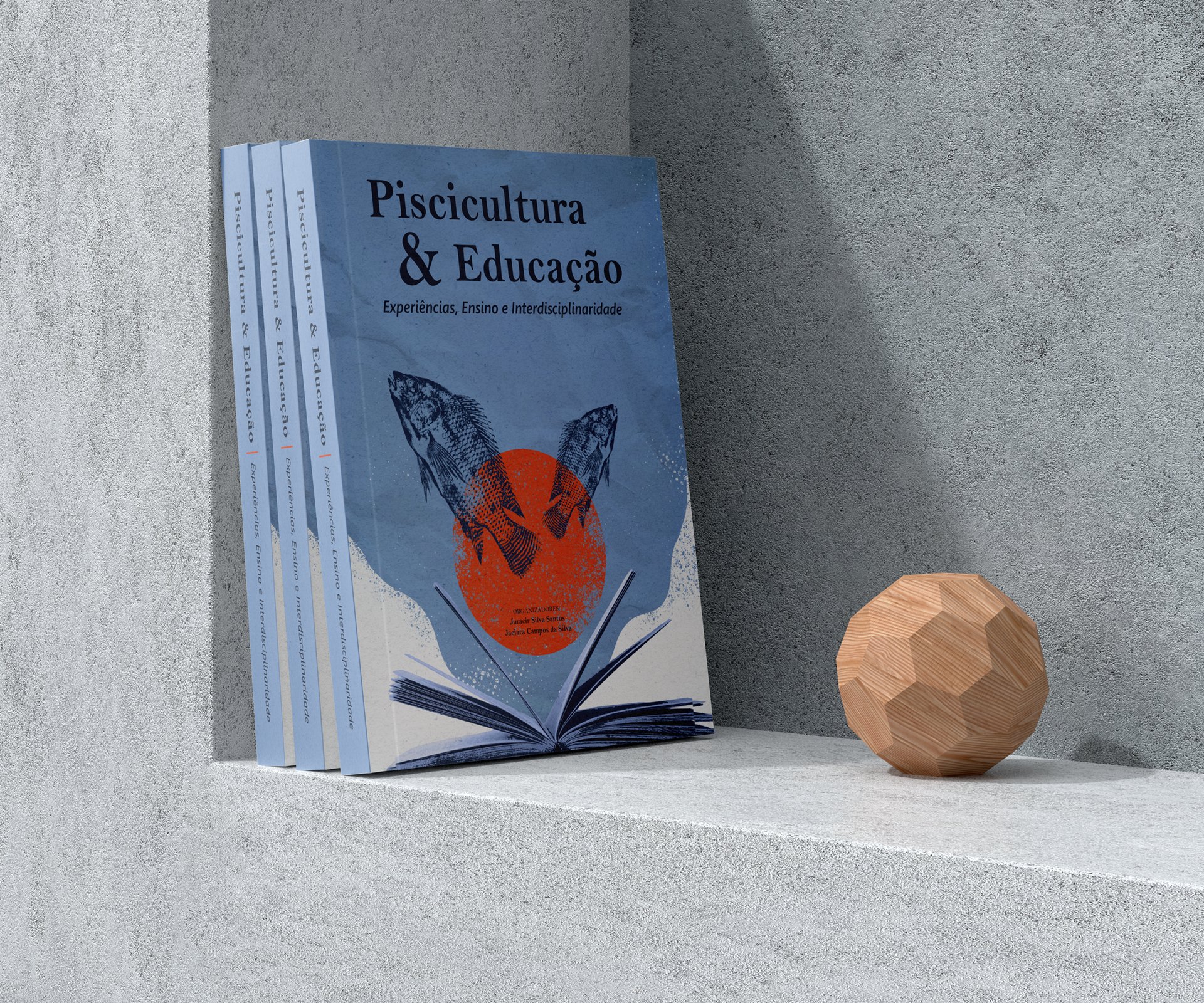
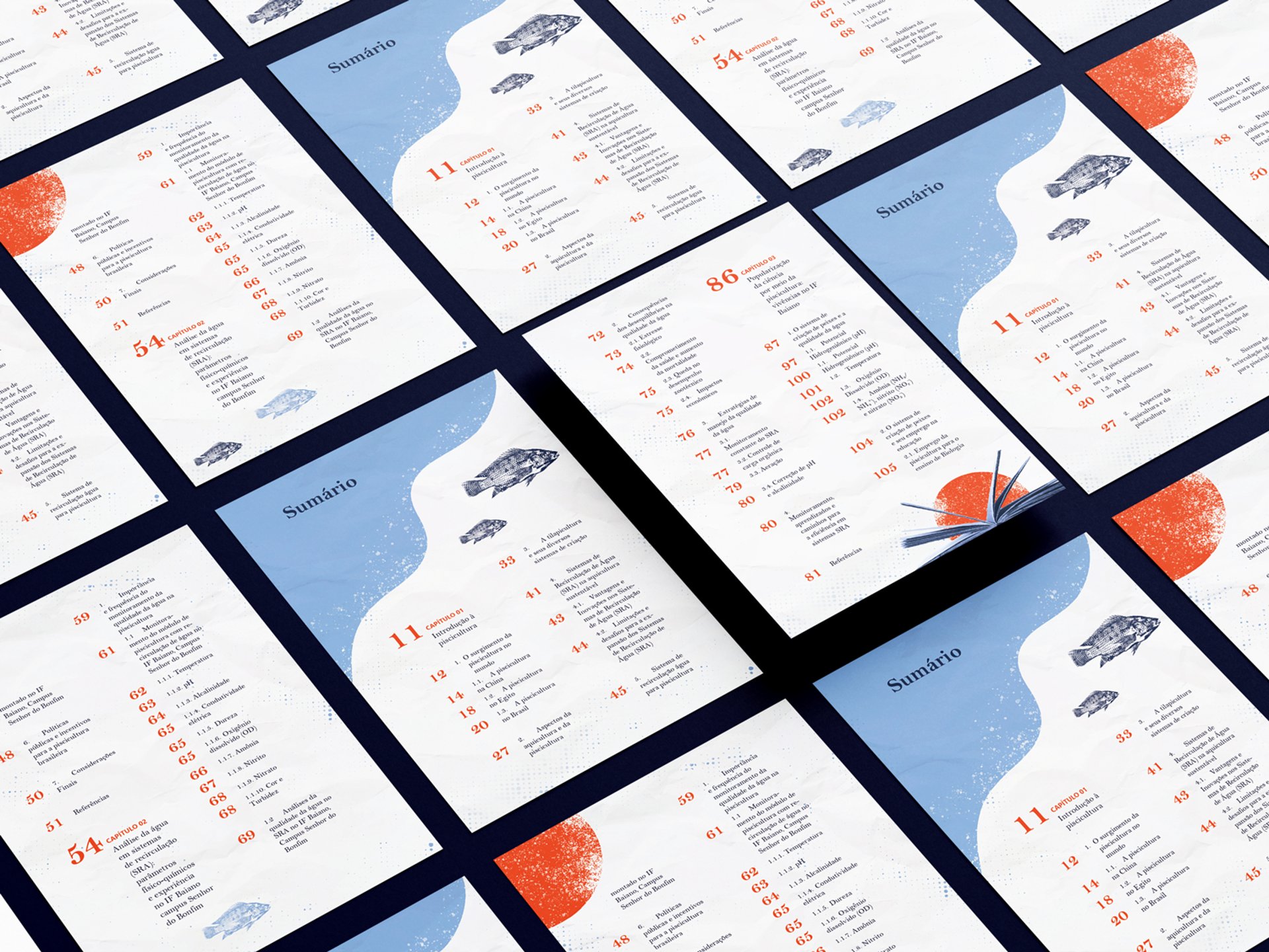
The visual identity was built around simple, intuitive symbols, using a book to represent education and fish to represent fish farming. To support these elements, we incorporated organic shapes inspired by the movement of water, along with subtle textures that reinforce the themes explored throughout the publication.

A crumpled paper texture was introduced as a nod to the educational environment, while a second texture inspired by water bubbles strengthened the connection to fish farming. At the center of the composition, an orange circle symbolizes the birth of knowledge, while serving as the anchor that brings all the graphic components together.

Color Direction

The color palette was built around navy blue, light blue, orange, and white. The blue tones reinforce the connection to water while conveying the sense of trust associated with education. Orange was used to create focal points and visual contrast throughout the publication.

White and negative space were applied strategically to bring balance to the layouts, keeping the pages from feeling overloaded.

Typography Direction

The initial typography direction combined Bell MT for the body text with Segoe UI for headings and highlighted elements. As a serif typeface, Bell MT provides greater reading comfort for long-form content, while Segoe UI brings a clean, contemporary look.

During the process, the client expressed a strong preference for Segoe UI and decided to use it for the body text as well. Although this differed from the original editorial recommendation, the decision was respected and applied consistently throughout the book, meeting the client's expectations while maintaining overall visual cohesion.

#172438

#7f9ece

#e94821

#ffffff

Bell MT

Segoe UI

Thanks! 🧡

Thaysa Valença

Together, we turn challenges into effective solutions!

Contact

thaysavalenca71@gmail.com

© 2024. All rights reserved.

Medias