

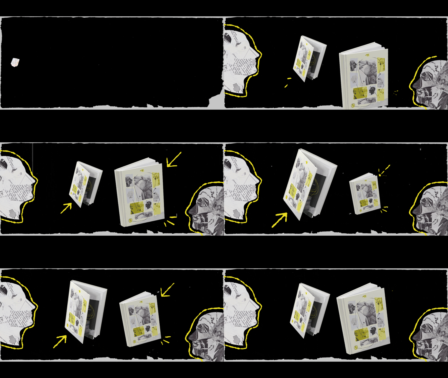
A ciência do invisível | Editorial & Visual Identity [2025]
This editorial project was developed through Even3 for the digital magazine of the Official Forensic Department of Rio de Janeiro. The challenge was to create the visual identity for the seventh edition, connecting themes of investigation, memory, and historical storytelling.
Context
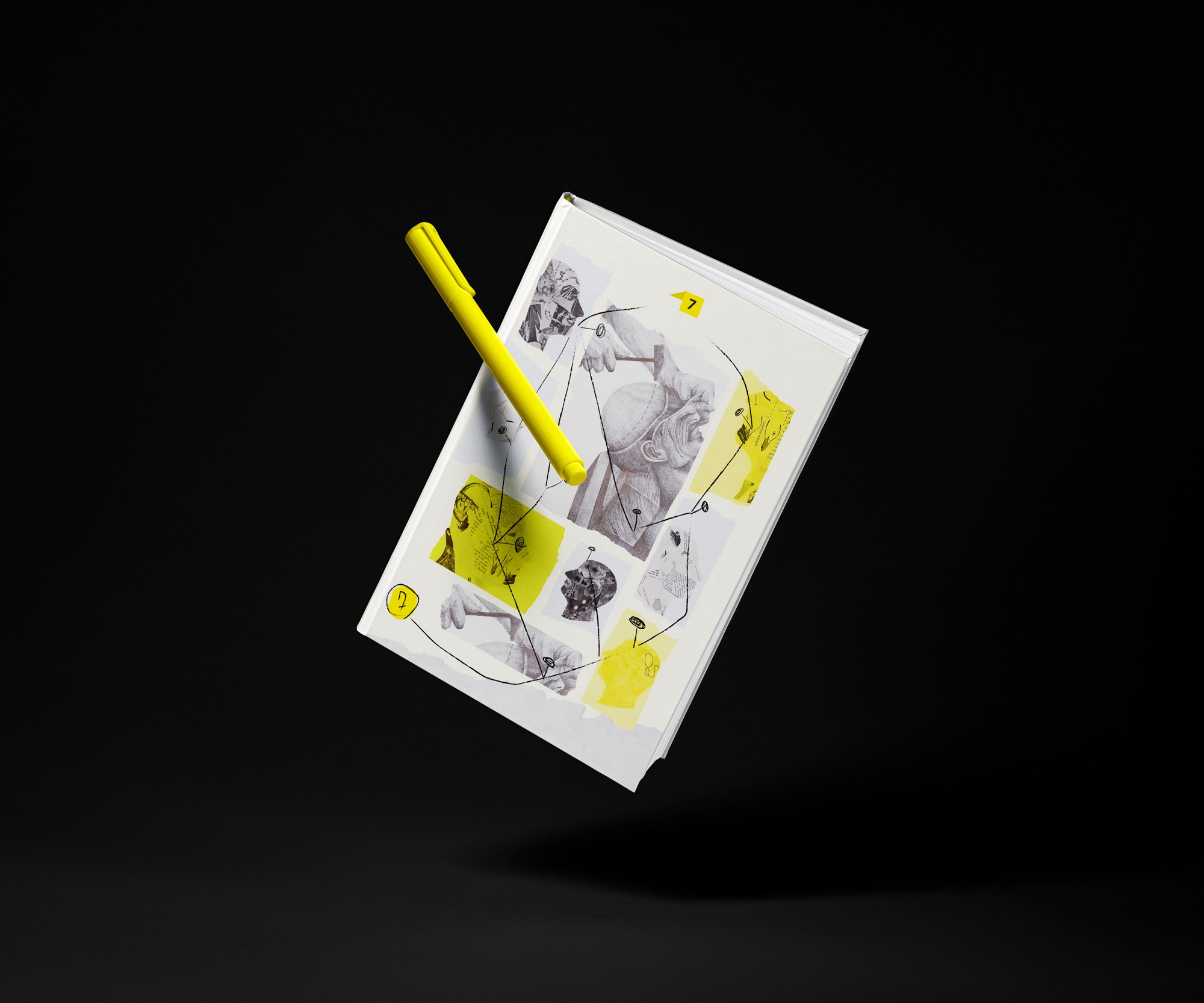
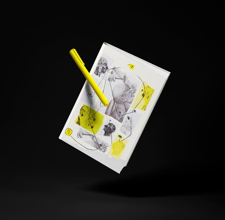
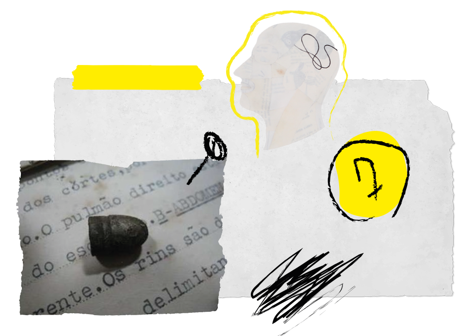
Since the brand already uses black and yellow as its primary colors, I kept that foundation and introduced the numbered evidence marker commonly seen at crime scenes as the central visual element. It appears as a subtle detail throughout the publication, helping tie the edition's identity together. Because this specific edition focused heavily on memory, I wanted to avoid a design that felt too structured or overly rigid.
Concept and Direction
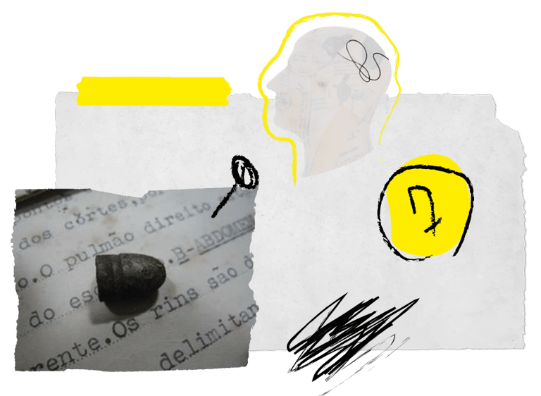
The concept was inspired by the process of building a case, specifically the classic imagery of photos pinned to a wall, connected by lines, with notes added almost instinctively. I wanted each page to capture that feeling of a work in progress, as if the connections were still being made, rather than something too organized or overly polished. An investigation is rarely linear, so the visual language followed that same philosophy.
The client shared references with a handcrafted feel, which I translated into a digital format. To achieve this, I used:
Illustrator effects to simulate pencil strokes
Custom-drawn pins created specifically for the project
Lines connecting images like an investigation board
Overlapping photos and graphic elements
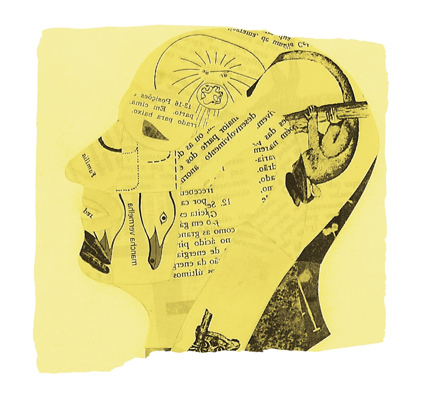
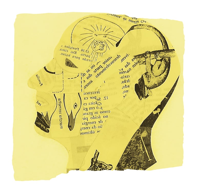
Although the project was developed entirely with digital tools, the goal was to preserve that handmade texture, keeping the sketches and the almost physical process of building the visual narrative alive.


Memory and time
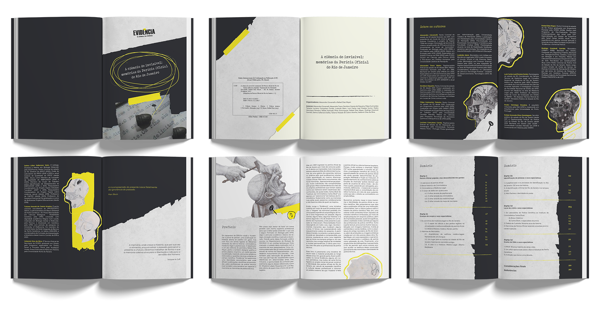
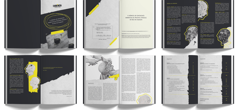
The theme of this edition was memory, so I wanted the design to reflect the passage of time. I used torn edges, overlapping layers, and subtle, intentional imperfections throughout the layouts. The goal was to make the pages feel as if they had been handled over the years, almost like old files being revisited.
Typography Direction
I chose a typewriter-inspired typeface to reinforce the idea of a historical document. It helps place the reader in that specific context while supporting the overall concept without compromising readability.
ABCDEFGHIJKLMNOPQRSTUVWXYZ
abcdefghijklmnopqrstuvwxyz
.,;:!?@#$%&*()[]{}<>/|\-+_=“”‘’'"´`^~°ºª
Aa


Chapter openings
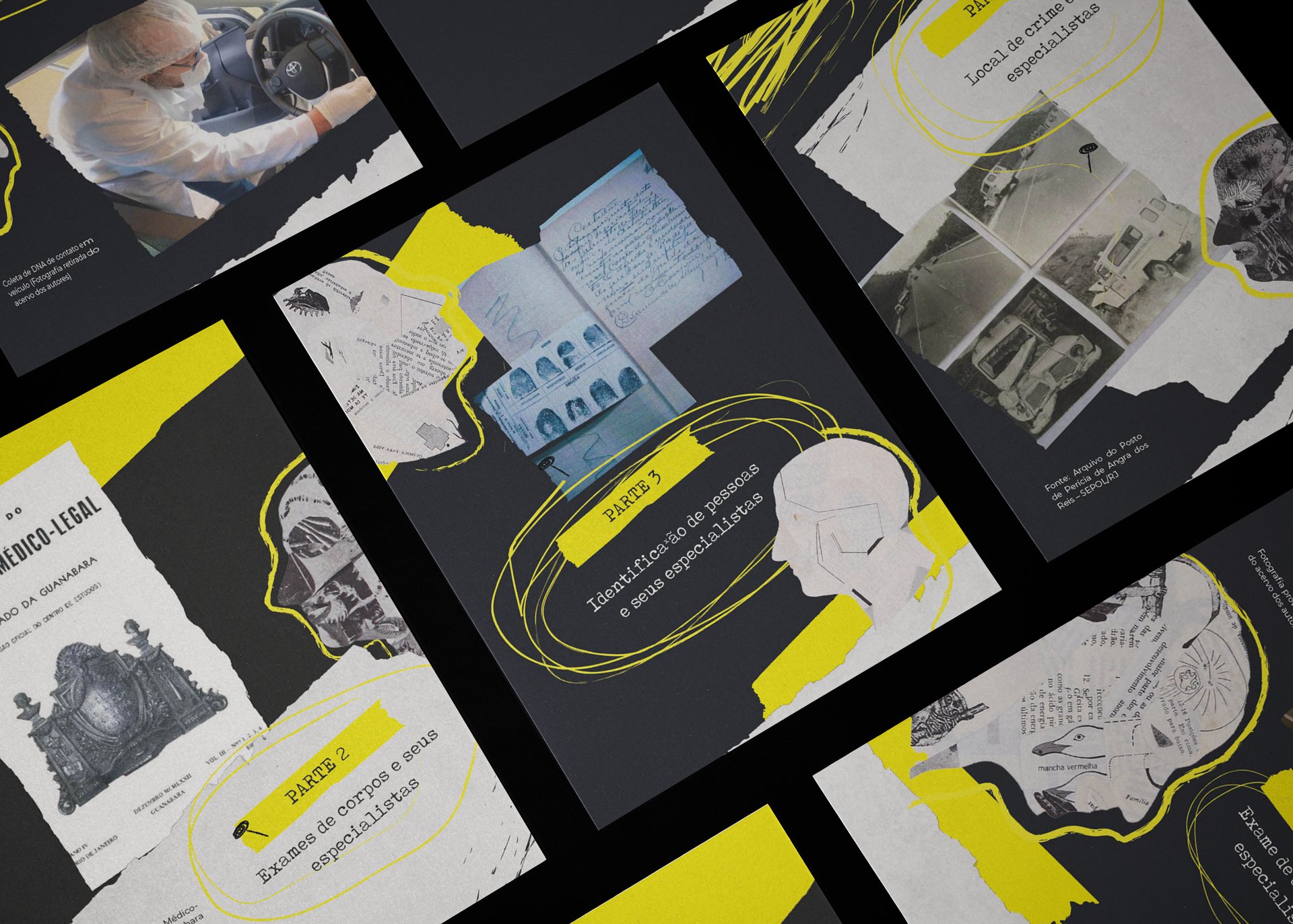
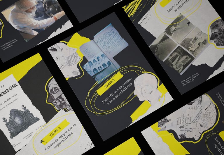
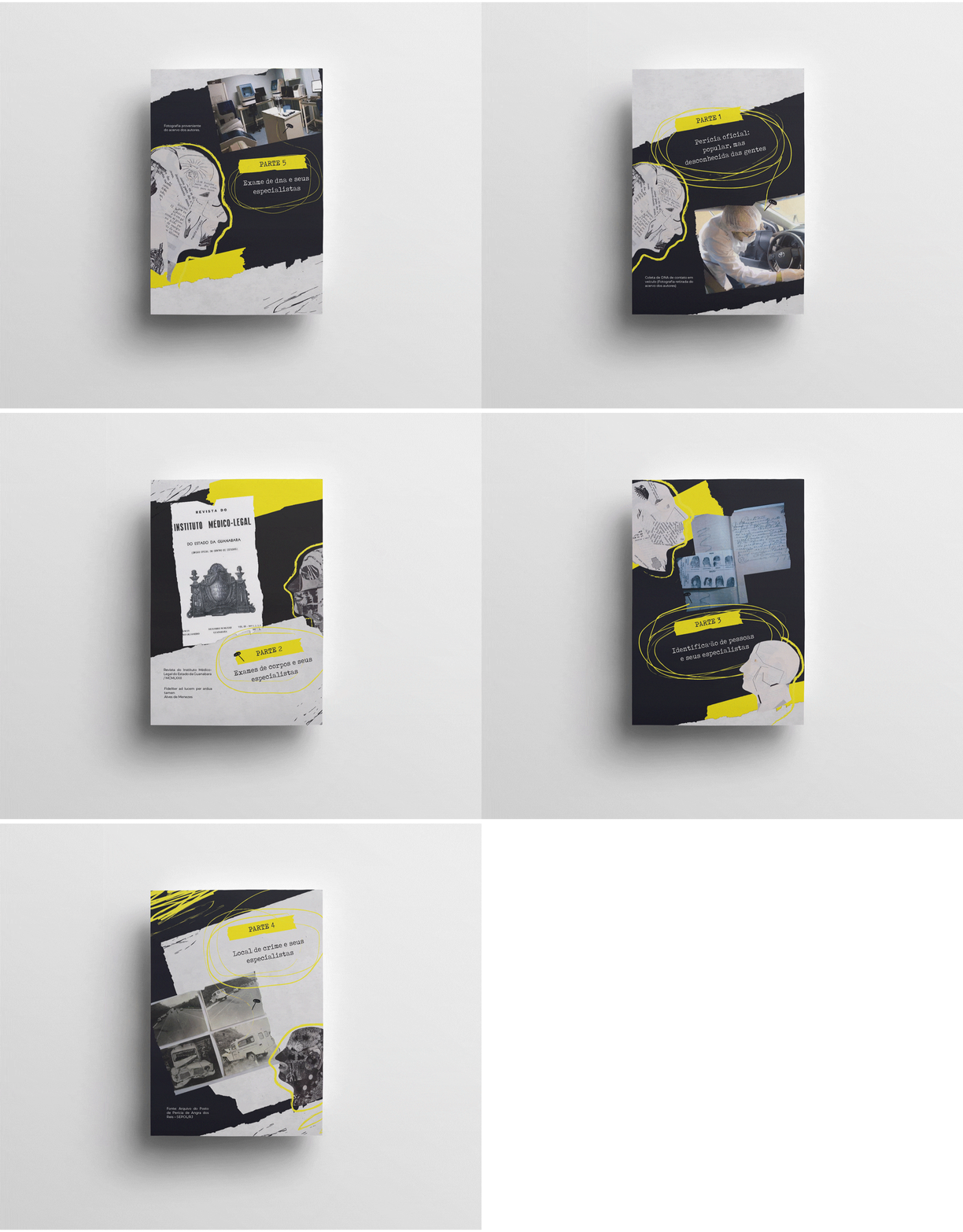
The client didn't want every chapter opening to follow the same layout, so each one was designed with its own unique composition. While they all share the same visual language, they vary in structure, creating a better reading rhythm and keeping the publication from feeling repetitive.

Thanks!
